
Creating a communication
Go to Campaigns > inApp/inWeb

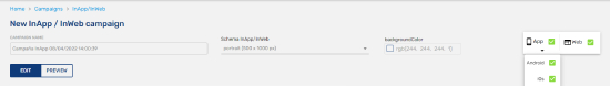
To create a New Campaign, you need to pulse on the button New Campaign inApp/inWeb.

After clicking the New Campaign button, the area to create the notification appears on the screen with these fields:
- Campaign Name - it is visible only for you
- Schema inApp/inWeb - Choosing one previously created in this section
- Background Color - Choosing the background color for your space
- App / Web - At the right area, you can click choosing Web (inWeb) and App (inApp) and then select from the drop-down menu Android, iOS or both and Web.
Content
On the Campaign tab, we have these elements:
In the content area, you see first row types (the structure of design) with 5 options. Then you see the content types to choose what introduce on every row: html code, text, image, button, carousel (slideshow of images to move using directional arrows) and form. With any of these possibilities you can edit several options to make a fabulous inApp/inWeb.
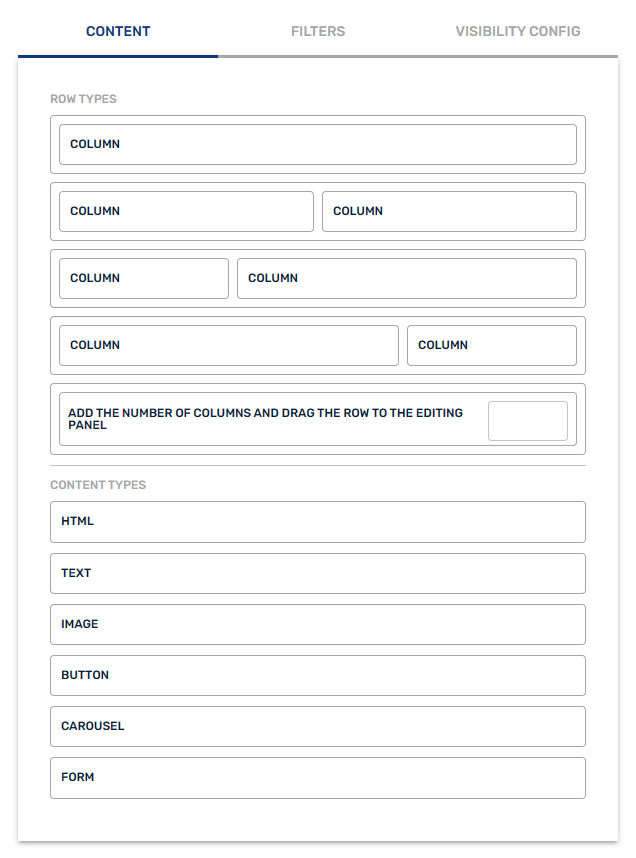
Row Types
You click on one of the 5 row types, then drag and drop on the inApp/inWeb area to design it. You can use this estructure of rows:
- 1 column (100%)
- 2 columns (50% - 50%)
- 2 columns (25% - 75%)
- 2 columns (75% - 25%)
- Write the number of columns you need.
Content Types
You click on one of the 6 content types, then drag and drop on the row/column to design your customized space. Each element has several options to select paddings, margins, borders, background colour, position, border button, padding button and background color button.
- HTML code
- Text
- Image
- Button
- Carousel: Upload a maximum of 10 images
- Form: You can choose these options:
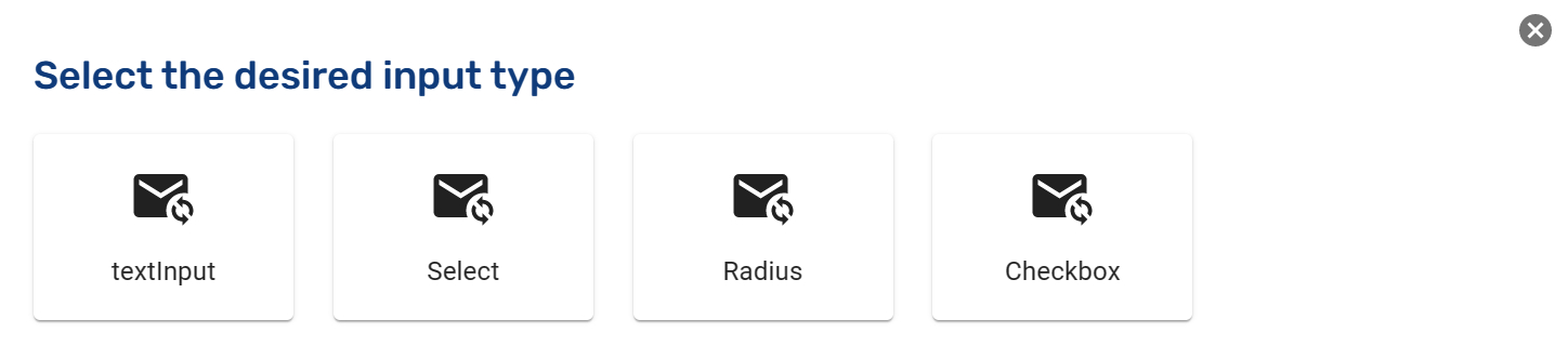
- TextInput: Space for the user to write
- Select: Selection of options to choose by the user
- Radius: Selection of two options (left and right) to click (only one)
- Checkbox: Selection of some options to check (one or several of them)
For all options, you have the possibility to create it as a compulsory field and you can also create a customer journey with the information received to start your communication plan.
- Check this box to indicate that it is a required field
- Send to customer journey
Variables
It is possible to use variables to create more personalized messages. Simply include the name of the database field where the variable is stored within the text, enclosed in double curly braces (e.g., {{variableName}}). For example, if you want to write a personalized greeting: Hello**{{name}}**, congratulations on your {{age}} birthday!
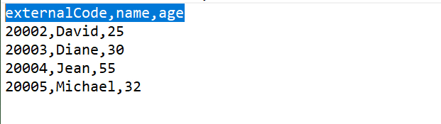
If you want to upload a .CSV file directly, make sure to create columns with the names of the variables, placed next to the main identifier, such as externalCode or deviceId.
If the communication is designed using HTML, the functionality remains the same—you should indicate the variable name using double curly braces.
<h1> Hello {{name}}, congratulations on your {{age}} birthday!</h1>Filters
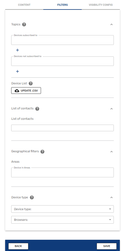
By segmenting your audience, you can significantly improve your campaign results. indigitall provides powerful filters to help you deliver the most relevant message to each user:
- Topics: Target devices that are subscribed or not subscribed to specific topics.
- Device List: Upload a .CSV file where the primary column is externalCode (or deviceId for certain custom configurations). You can also include additional columns for custom fields if you are using variables.
- List of contacts: You can select a contact list previously created in the Audiences / inApp-inWeb / Lists of contacts section.
- Geographical filters: Select a predefined area, as explained in this section.
- Device Type: Choose between mobile, tablet, or desktop, and further refine by browser (Safari, Opera, Edge, Firefox, or Chrome).
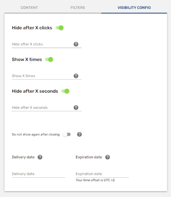
Visibility Configuration
Your message can dissapear after a selected number of clicks, viewings and seconds so you have the total control. Moreover you can choose the delivery and expiration dates.
- Hide after X clicks: Once the space has been clicked X times, then the space will be hidden.
- Show X times: After showing the space X times, it will be hidden.
- Hide after X seconds: After X seconds of publishing the space, it will be hidden.
- Do not show again after closing: The space won't publish again when the user has closed it.
- Delivery Date: Date to publish the space.
- Expiration Date: Date to unpublish the space.
Finally you can finish your campaign pulsing on Save button.
Updated 4 months ago